Table of contents
Want the fast version?
Open Studio, upload one design, pick one product, generate 10 outputs, then expand from there.
What Etsy listings actually need
An Etsy gallery has a simple job: reduce uncertainty. Your images need to show what the buyer gets, what it looks like in context, and enough detail to avoid “is this real?” questions. High-volume sellers usually do this with a small set of repeatable gallery roles:
- Hero image: clean, centered, readable design, minimal distractions.
- Lifestyle images: scale and vibe (room, model, desk, etc.).
- Detail images: fabric/print close-up, sizing, material callouts, or fit.
The goal is not “more mockups”. It is repeatable coverage so each listing feels complete and your store feels consistent.
A practical batch strategy (variants + gallery roles)
Start by deciding what you actually ship. If your listing offers 8 colors, your gallery should cover those colors without looking like 8 random crops. A good default strategy:
- Create 1 hero per color for the first 4–6 best-selling colors.
- Create 2–3 lifestyle images (not per color) that sell the vibe and scale.
- Create 1–2 details that reduce support tickets (print close-up, sizing, material).
If you are unsure how your gallery should look, start with this guide’s sister checklist: Etsy listing mockup checklist.
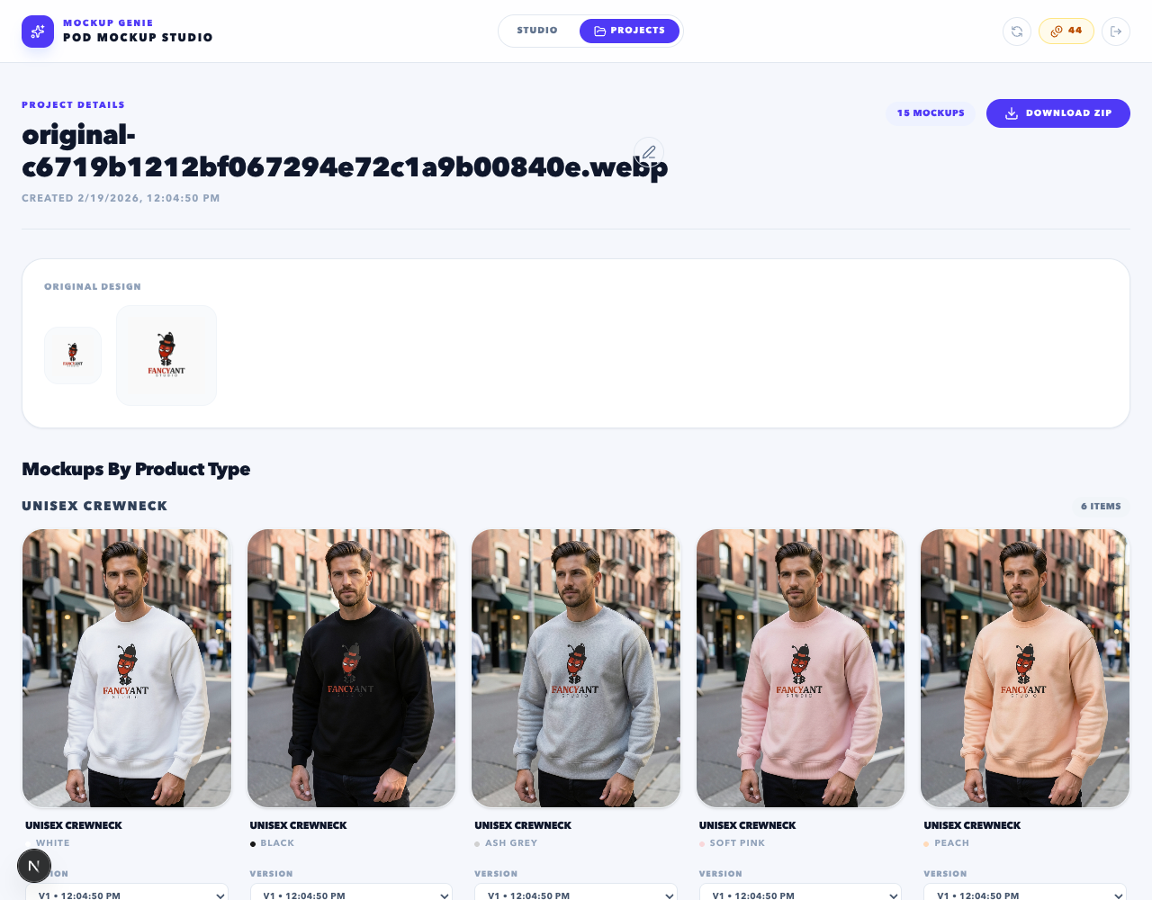
Run the workflow in Mockup Genie Studio
This is the fast path that matches how sellers actually work. If you want to follow along, open Studio (account required) and do a small run first.
Batch setup
- Upload a high-res PNG (prefer transparent background).
- Select product(s) and the color variants you actually sell.
- Pick one aspect ratio that matches your listing strategy.
Generate + export
- Generate a small batch and QA the first 10 outputs.
- Scale up to the full queue once framing is correct.
- Export as a ZIP for quick mapping to listings.
Tip: keep your runs organized as projects. You can manage outputs later from Projects.
Consistency rules that prevent weak galleries
Consistency is what makes “bulk” look premium. These rules are simple, but they remove 80% of the issues sellers see:
- One crop rule: decide a framing target (tight/medium/wide) and stick to it across the listing.
- One lighting vibe per batch: mixing harsh studio and warm lifestyle in one gallery looks inconsistent.
- Readable hero first: buyers should understand the design at a glance in the first image.
- Use details to reduce questions: size charts, material notes, and close-ups reduce friction.
Export naming that maps to listings fast
Publishing speed comes from naming, not from generating faster. A good naming pattern has three parts:
Recommended: SKU_or_DesignName + Color + Role
Example: retro-flower_black_hero, retro-flower_black_lifestyle, retro-flower_detail-print
If you batch by campaign, add a campaign prefix too. The goal is to make “upload to Etsy” mostly drag-and-drop.
Common mistakes (and how to avoid them)
Too many similar images
Ten heroes that look identical wastes gallery slots. Mix roles: hero, lifestyle, detail. Make every image earn its place.
Variant mismatch
If you show colors you do not sell (or forget a best-seller), you create confusion. Generate from your actual SKU list.
Inconsistent cropping
Mixed framing looks like multiple sellers. Pick a crop rule and stick to it for the full batch.
No QC pass
Batch does not mean “publish blind”. Run a fast QC and regenerate only the flagged outputs to control spend.
Next guide: Mockup Genie vs manual workflow if you are deciding what to automate and what to keep manual.
References
Platform docs and workflow references used to keep this guide grounded.